
Front-end Development & User-centered Design
Front-end Development & User-centered Design
Written by Robert Hoekstra, translated to English with AI
User-centered Design (UCD) is crucial within the development team. In this article, I explain what you should and shouldn't do to become a better developer and or designer.
What is User Centered Design?
As the name suggests, User Centered Design (UCD) focuses on design where the user is central. It is the key to creating a user-friendly product that appeals to the user pleasantly.
Some examples where UCD is applied:
- Mobile apps: with clear communication, recognizable and intuitive interfaces, and actions.
- Webshops: an efficient and seamless shopping experience to easily allow users to discover and buy products.
- Healthcare: complex technical solutions that make it easy and clear for patients and caregivers to communicate with advanced medical equipment.
- Automotive: a car has a good design when the driver has a pleasant driving experience and can intuitively handle the controls.
- Banking: an optimal and secure environment where the user can easily perform transactions and other banking activities.

We absolutely want to avoid an user:
- Getting frustrated;
- Being unable to use the product;
- Being unable to use the product under certain circumstances;
- Not knowing where to find functions or information;
- Having to wait long;
- Feeling out of control.
To show how broad UCD can be and how important it is to get it right, here is an example of a product that frustrates the user: the public transport gates at the station. The gates are always a good example of a bad user experience. A product that has been part of our society for some time now. With more than one million travelers per day, you would think this is one of the most tested products in the Netherlands. When you look around at Amsterdam Central or Schiphol, you often see tourists having problems with our public transport system. But ordinary citizens also have to deal with this piece of technical ingenuity.
Are you left-handed?
The public transport system is mainly geared toward right-handed people, but a day of traveling as a left-handed person can be an interesting challenge. Try not using your right hand for a day and discover how to navigate the transport system. You will likely encounter some obstacles, such as having to open gates with your left hand and opening gates incorrectly.
Do you have extra luggage with you?
One suitcase is usually manageable, but it becomes a challenge when you have two suitcases or a bike and a suitcase. Check-in, maneuver your bike through the gates, and walk back to pick up your suitcase. But wait... the gates are closed. Now you have to check in again, resulting in the error message: "You are already checked in."
Traveling with different carriers from A to B?
Imagine you comfortably travel by train from Emmen to Zwolle, but upon checking out, you discover you have to pay an entry fee of €25... This is because you used your card at the wrong gate.
Your friends are waiting on the other side of the station?
Walking quickly through a station seems like an easy task, but what if you don't have your OV card with you? That's inconvenient because now you have to buy a ticket or walk around the station.
For viewing pleasure, I refer you to an item from the Telegraaf:
And on the web?
It doesn't always go well on the web either. Let's take the following website as an example: http://www.007museum.com/. What goes wrong here?
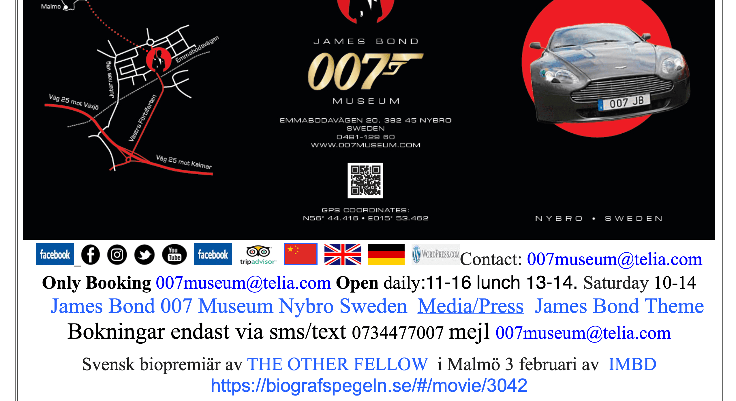
Too much of a good thing
The header on the website is full of information, making it difficult for the user to quickly determine which information is relevant. Various elements in the header look interactive, but unfortunately, this is not the case. Functions are also confusing. When you click on a flag to change the language, you are led to a newly translated page, where music suddenly starts playing.
Moreover, the page is full of photos, and there is no clear flow of information. Events are scattered all over the website, and the webpage is so large that you have to scroll to find the bottom. Visiting the page on a mobile phone? It becomes even more difficult.
In general, the user has no clear idea of what is happening on the website and what the goal is. While the goal of a 007 museum website is quite clear: enticing visitors to visit the museum.
Summary of what goes wrong on this website:
- Insufficient accessibility;
- Unsuitable for different devices;
- Complex navigation;
- Poor performance;
- Lack of consistency;
- No option to change the website.
It is important to remember that this website should not be followed as an example. Visit the website and experience it yourself. Let's see how it should be done!
The power of User Centered Design
The power of User Centered Design (UCD) is emphasized by focusing on putting the end-user at the center in our role as developers. This allows us to create a product that meets the specific needs and expectations of the user.
- Involving users in the design process from the beginning: By involving users in the design process from the beginning, it is easy to gauge the user's needs and make choices based on them.
- A clear consideration of the different interests of the users: Users are not the only stakeholders in a project. The client's objectives are also important. Therefore, it is important to strike a clear and logical balance between the needs of both stakeholders.
- Continuously collecting feedback from the user during the design process: To make good choices that meet the user's needs, you must regularly collect feedback from the user. This keeps the process tight and prevents making wrong choices that do not align with the user's needs.
- Maintaining an iterative design process: By keeping the lines with users short and regularly collecting feedback, the team can maintain an iterative design process. As the developer better understands the user, the user experience of the product can be further developed.
The 5 steps in the Design Thinking Process
The principles of UCD align well with the five steps of the design process. To understand the user well, it is a good habit to apply the following steps in our work:
- Empathy: Focus on understanding the user by conducting user research and talking to the user to map their specific needs and expectations.
- Define: Formulate the user's problems and needs and frame them within the project goal.
- Ideas: Brainstorm and let your creativity run wild to come up with new and innovative ideas that meet the user's needs. Be careful with assumptions in this phase.
- Prototyping: Create physical or digital prototypes of our ideas to get a better idea of how the product fits together and how it will work in practice.
- Testing: Test our prototypes and collect feedback from the user. This allows us to adjust and further refine the product to meet the user's specific needs.
How does this work in practice?
It is important to emphasize that the process is not static and that there is always close cooperation and communication needed between different teams and departments so that all parties involved have the chance to give feedback and share ideas. This makes the design process more dynamic and increases the chances of creating a user-centered product that meets the end user's wishes and requirements.
Creating front-ends for the user
As a Front-end Developer, it is crucial to think carefully about who the end user of the product is. You are the last link between technology and the end user. Your work is only done when the front end of the product delivers a good user experience. Therefore, you must have a clear picture of what the user's needs and obstacles are. What are the demographic details? Where, when, and under what circumstances is the product used? And with which devices is the product used?
By considering these factors, we can quickly compile a clear list that will help us become better developers:
Make your product for everyone, not just 99% of users.
The internet is a common good and could be considered a human right. Accessibility is therefore of great importance in our work. Fortunately, the wheel has already been invented for us Front-end Developers.
When the correct HTML5 elements are written semantically, the browser solves a large part for us. It ensures that users can navigate more easily and that there is better accessibility. But we can make the experience for our users even better.
For example, use alternative texts for images. But also look at using the correct focus elements and aria-labels. How will someone with a screen reader use your product? Or someone who can only use a keyboard?
But also check if the layout of your product meets the accessibility guidelines. Contrast, size, placement, and many other design elements affect accessibility.
Use online tools such as Google Lighthouse or a WCAG scanner that tests your product for accessibility and even makes recommendations on found issues.
Consider different screens and devices
Everyone is unique and has preferences when it comes to using (web) applications. One person does everything with a tablet, and another still cannot part with their trusty metal-cased workhorse full of lights.
Naturally, the first thing that comes to mind as a developer is: Responsive Design. How do I make my product accessible on different screens? We can use CSS media queries and adhere to guidelines for different screen sizes. But it goes a bit further if we want to create an optimal experience for the user.
Adaptive Design is the art of adjusting an interface based on the product it is used on. For example, a smartphone has many sensors and settings that can be used to execute logic in our products. But also think about changing a navigation menu that not only adapts in layout but also in content to the mobile user's wishes.
Make navigation no more complex than it already is
Navigation elements are designed to make information simple and clear for users. So make sure these elements are in a logical and easily findable place. That is often at the top and bottom of a page. But navigation goes beyond a header and a footer.
Using the correct HTML5 elements ensures good content semantics. This allows users to navigate your content more easily, and their browser's behavior works optimally on their devices. But you can also provide functionality that helps users scroll to specific locations in the application.
Another nice benefit is that peripheral devices often use semantically correct pages. Adding the correct tab indices, aria-labels, and alternative texts helps a lot. You don't have to do much to provide a large group of users with a pleasant experience.
CMD-X (cut) the crap
Long loading times and unnecessary animations. There is no easier way to lose your users. When the user gets frustrated, they are more likely to break the interaction, which we don't want.
So think carefully about the goal of a 'screen'. Ensure that the goal is achieved as optimally as possible. Don't remove animations. On the contrary, they are essential to provide the user with feedback. Micro-interactions and large-scale changes need animation to help the user understand what is happening. But don't make it a circus. Ultimately, the user wants to reach their goal as quickly as possible.
Custom interfaces
When you want to create a truly user-friendly interface, ensure that the user is fully in control. And what better way to show actual controls to the user? Here are some options you could add:
- High Contrast Mode;
- Change Font Size;
- Remove CSS Toggle;
- Theme switcher.
But if this is not the intention for some reason, you can always provide the user with indirect control. How? By using:
- CSS properties such as: Prefers-Color-Scheme, Prefers-Contrast, Prefers-Reduce-Motion;
- Using relational units like REM;
- Using fallback properties like multiple Font-Family properties;
- Offering a mobile and desktop variant.
This way, no interface changes are needed, such as adding extra buttons or settings. But it ensures that users get an experience that adapts to the preferences of the device they have personalized.
Feedback, Feedback & Feedback
During product development, it is wise to regularly ask for feedback from the client. But why not from the end-user as well? By testing your product with the end-user, you give yourself the chance to receive valuable feedback.
You can apply various methods to validate whether your product meets the user. For example, give the user a task like "Share the weather forecast for Wednesday with your friends" and let the test person speak their thoughts out loud while performing the task.
All feedback from the test sessions can be taken into the next iteration. This way, you get to know the users better and build better front-ends for them!
Conclusion
When we develop our products with a 'User-centered Design' approach, we are genuinely working for the end-user. The iteration process is a cycle that you can apply as often as you like. The more iteration cycles you make, the closer you get to a product that seamlessly fits the needs of your users. As a Front-end Developer, you can make a difference for the end-user, together with your multi-disciplinary team or alone. That makes you the digital hero of today and the future!
Want to do some research yourself?
I am happy to guide you with some resources: